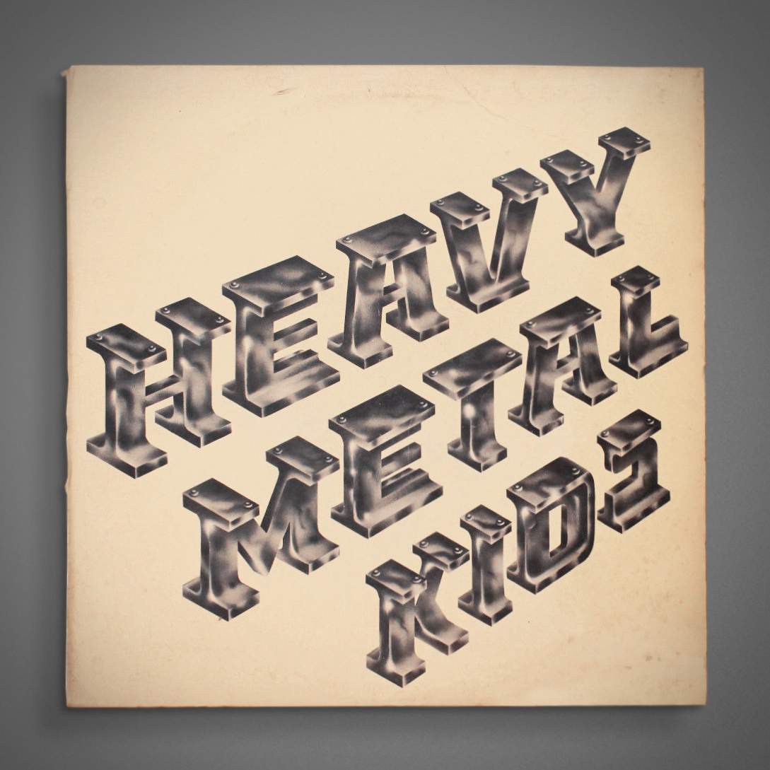
1974.
Link →

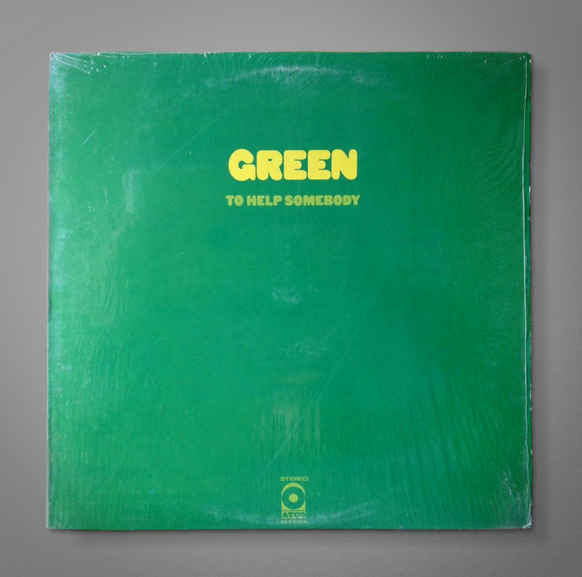
I applaud the effort—especially for 1969—but it doesn’t quite work on a couple of those letters. I like the “a” quite a bit, though. Kind of Aphex Twin.
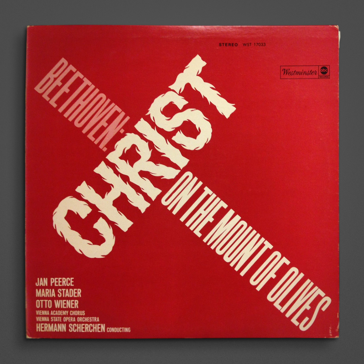
Link →
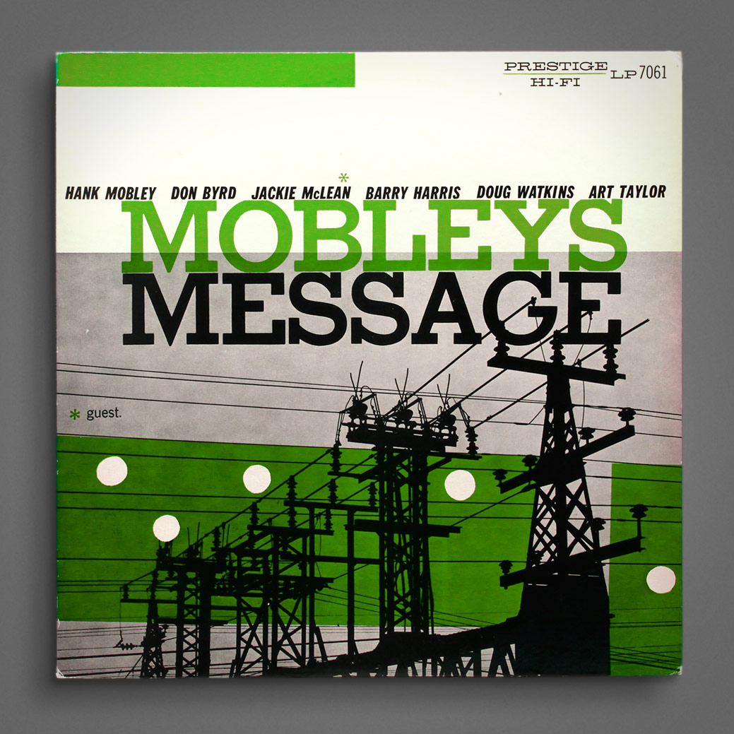
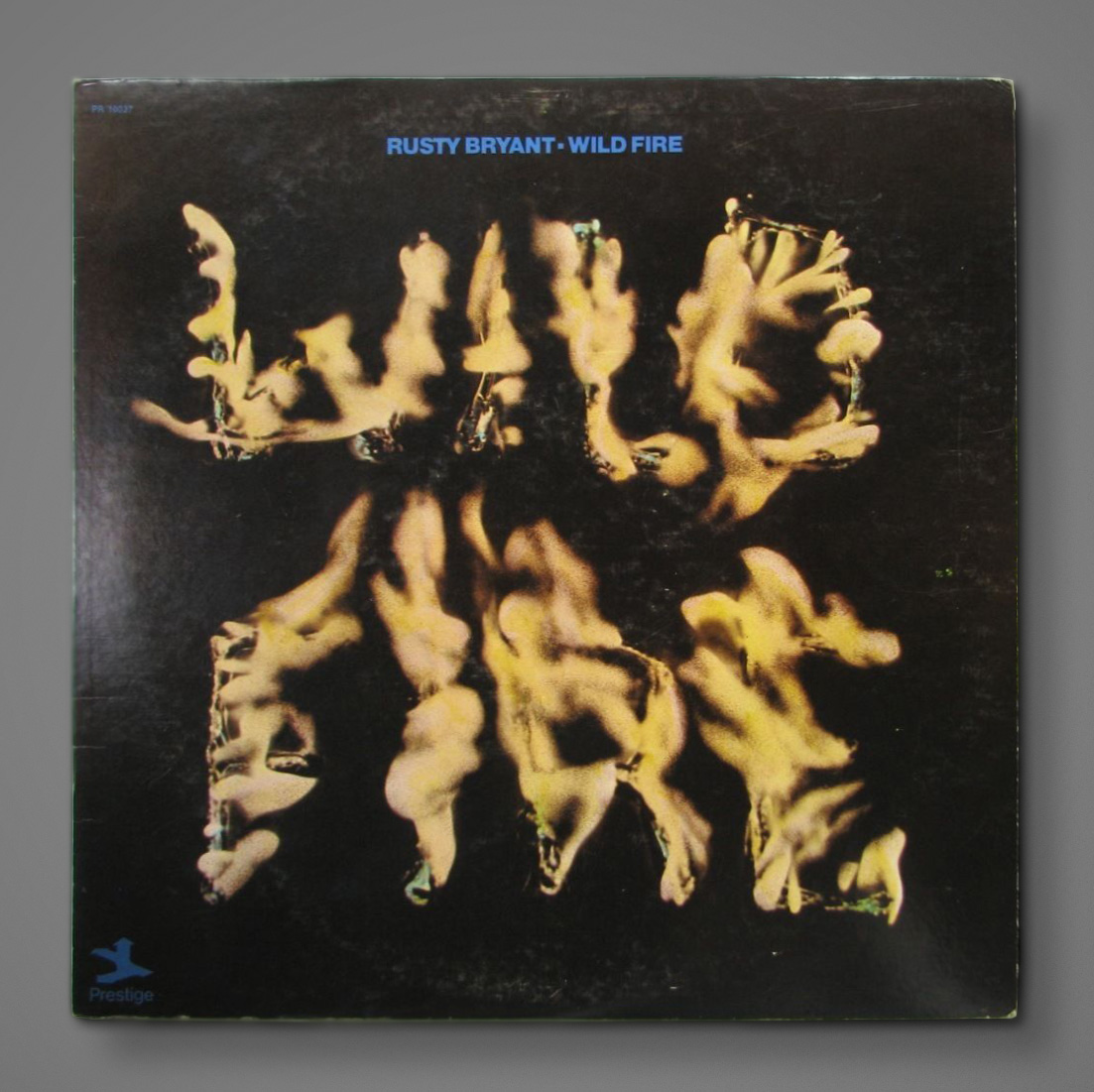
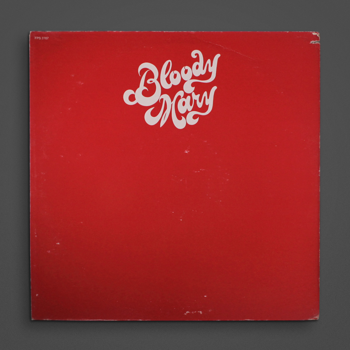
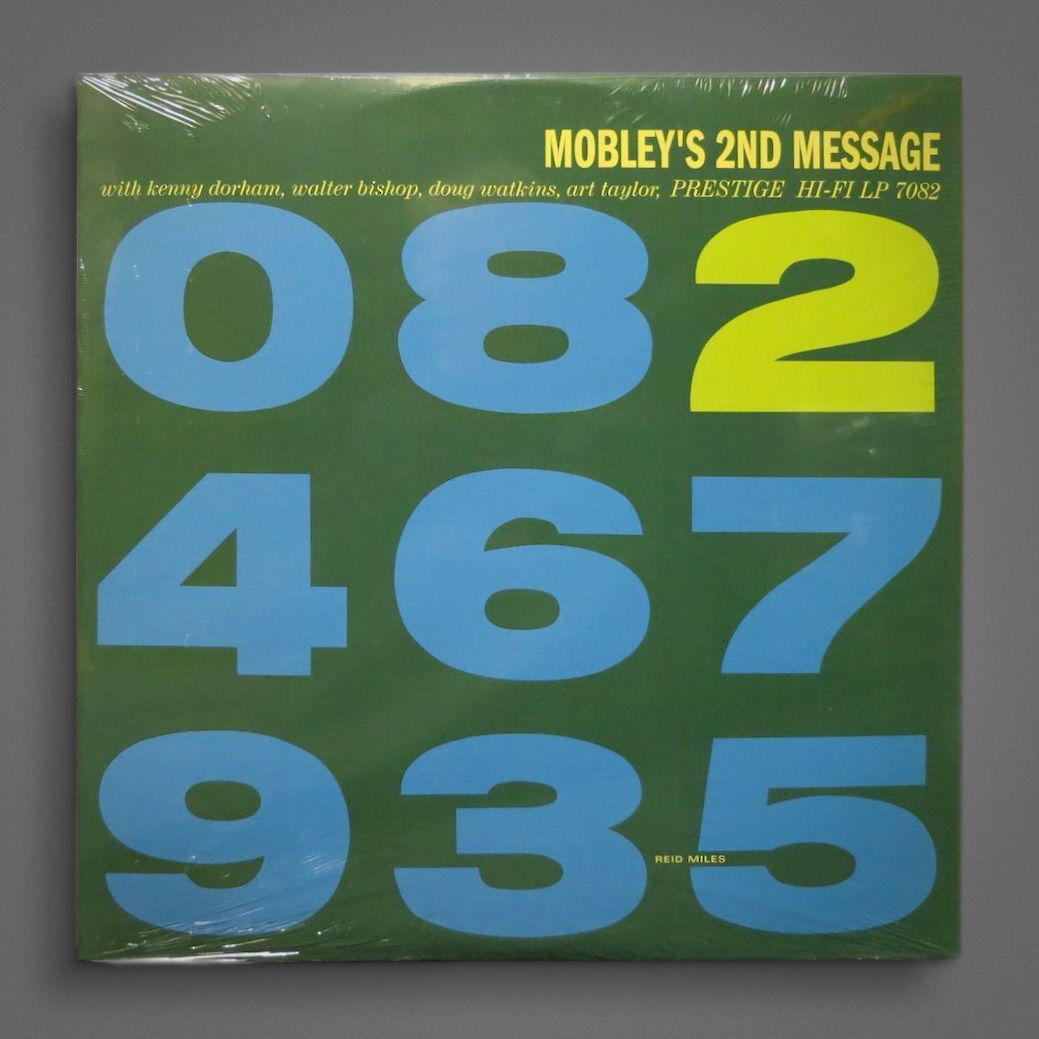
Was originally just gonna post the first one because of the cool slab serif, but then ran across “Second” and it’s even more typetastic. By Reid Miles, no less (though it’s Prestige.) 1956.
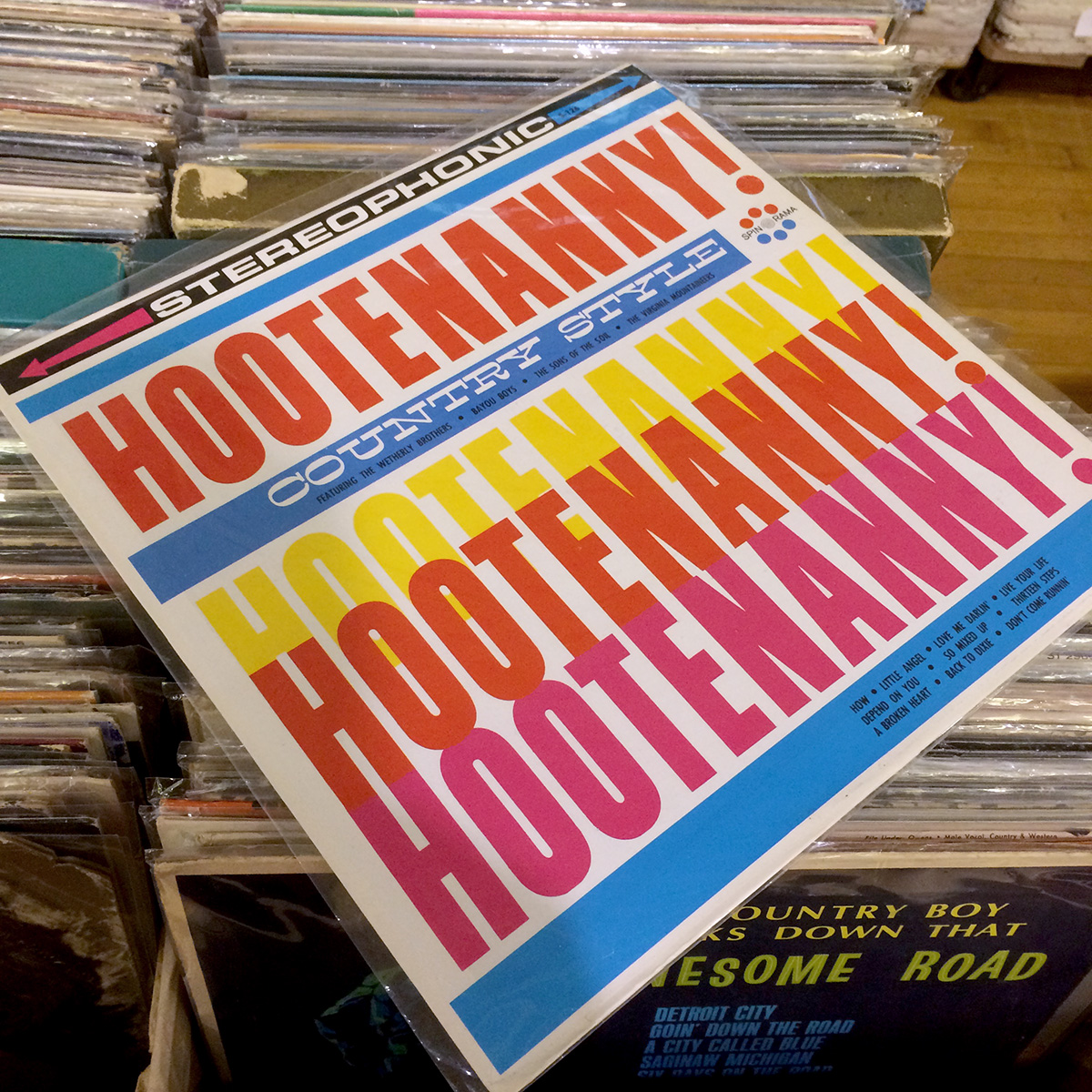
Link →