1974. “Design / Jules Halfant Art: Jacques Wyrs”
And they found a way to work in their second and third choices for cover type, too:
Another understated sleeve where the subtle style of the type makes it. 1975. Design by Gerard Huerta and Ed Lee.
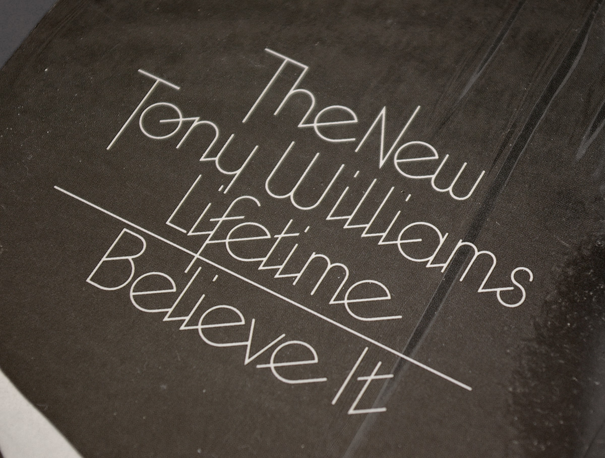
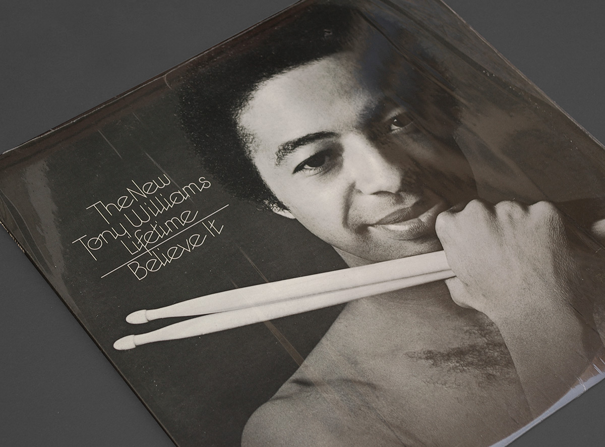
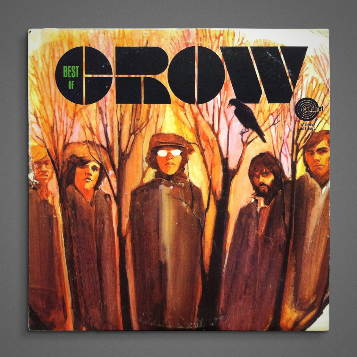
1976. Not an overtly typographic sleeve, but I like the type that’s there. Might have to make a font based on this.
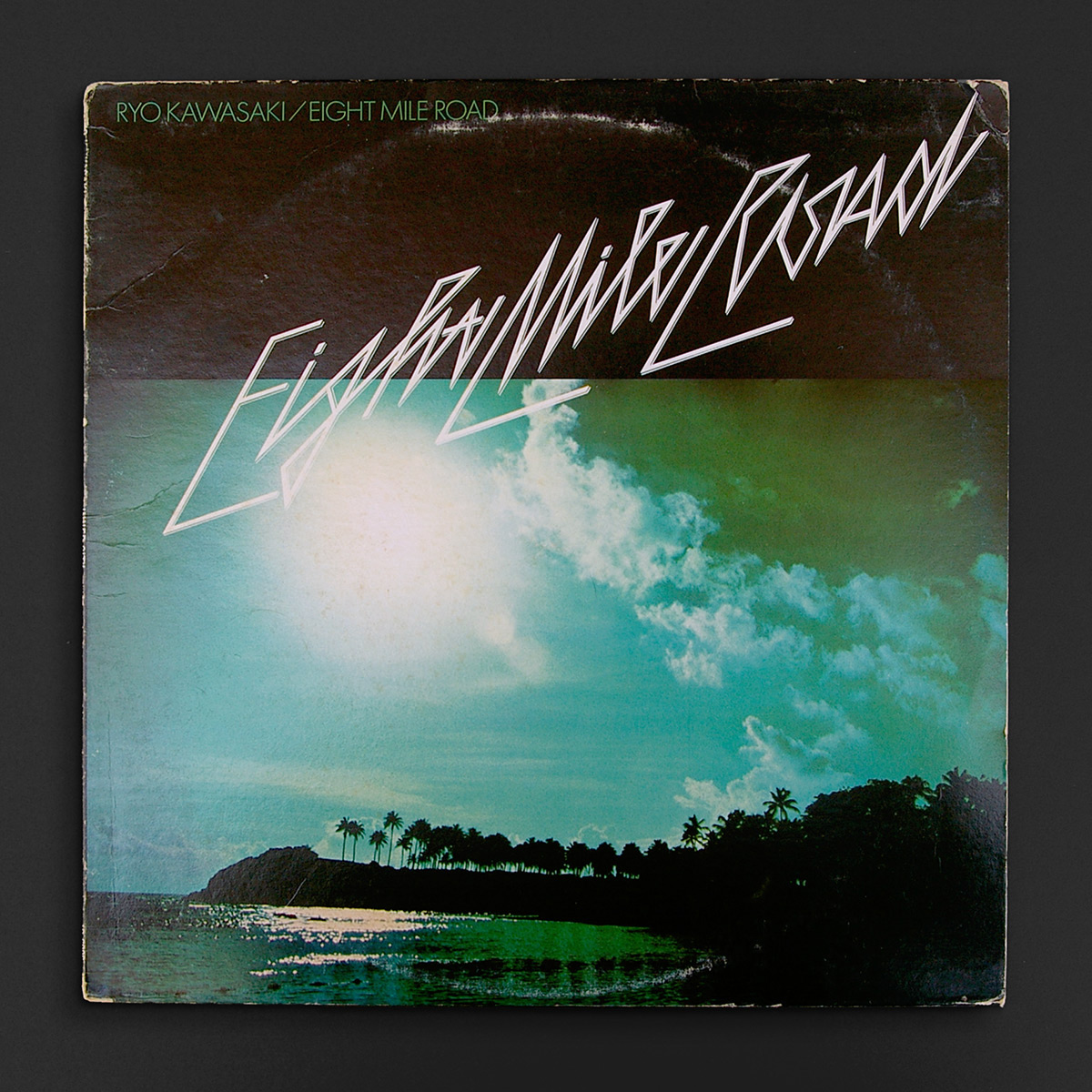
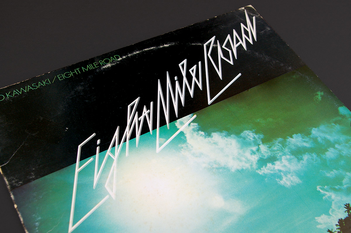
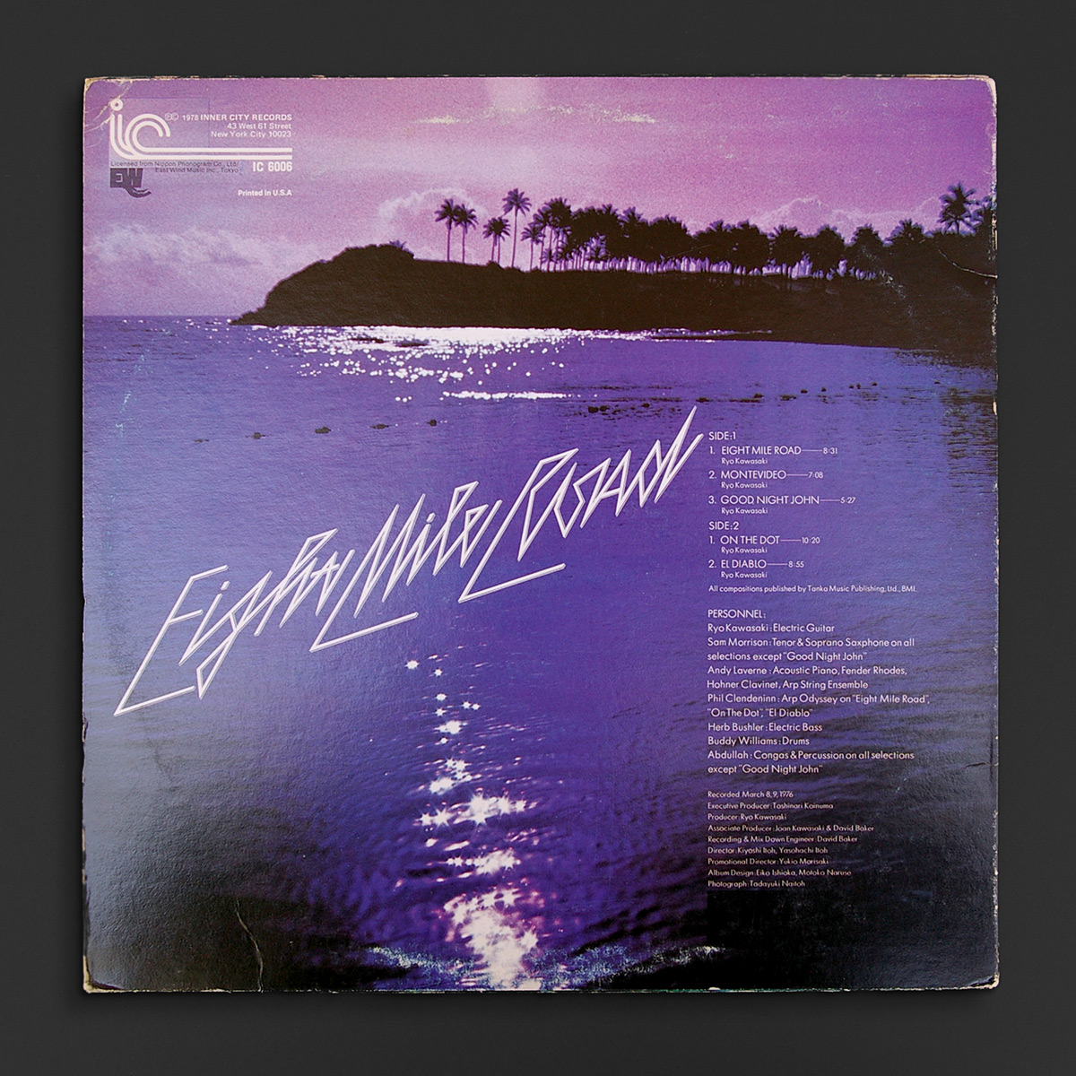
1978. Designed by Eiko Ishioka and Motoko Naruse.
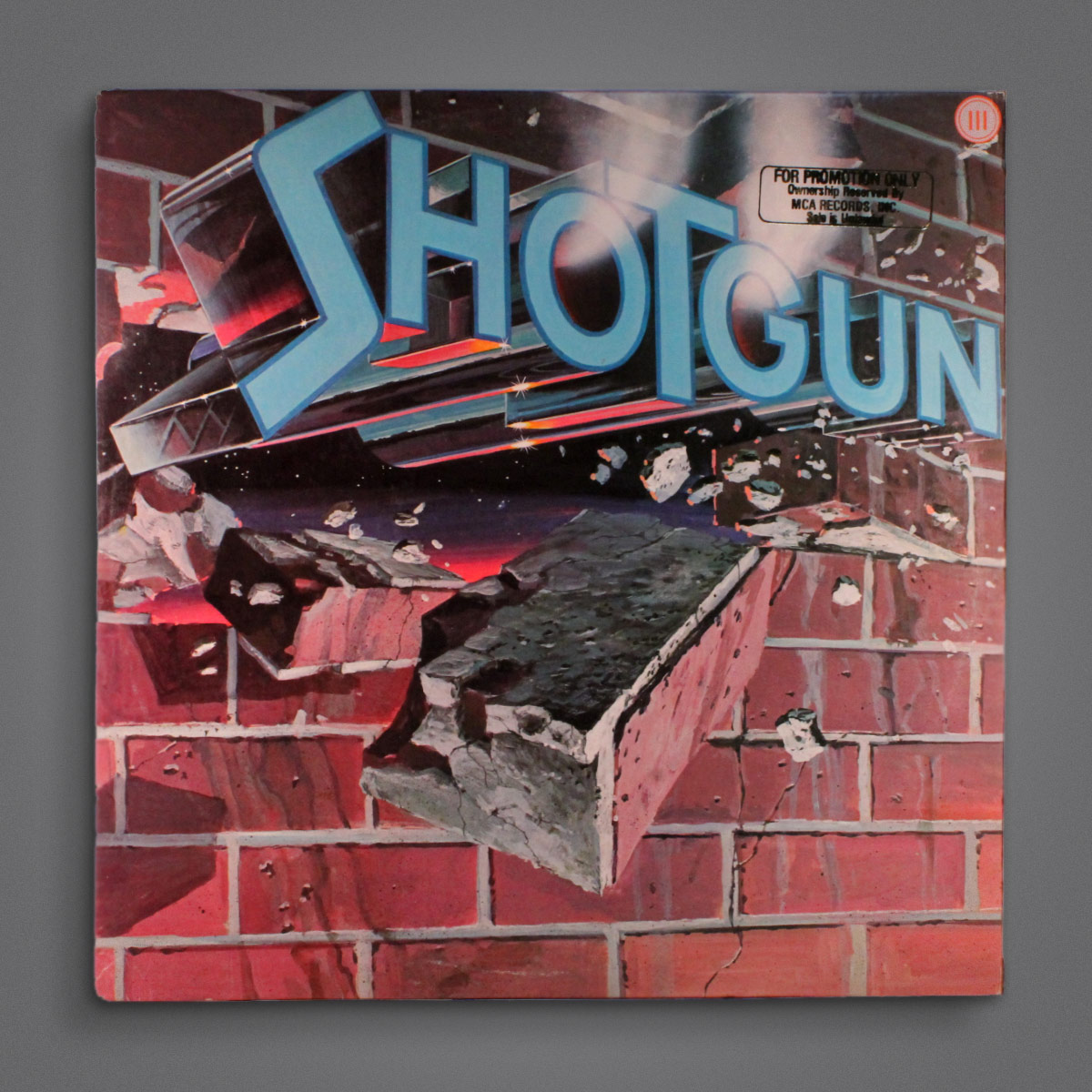
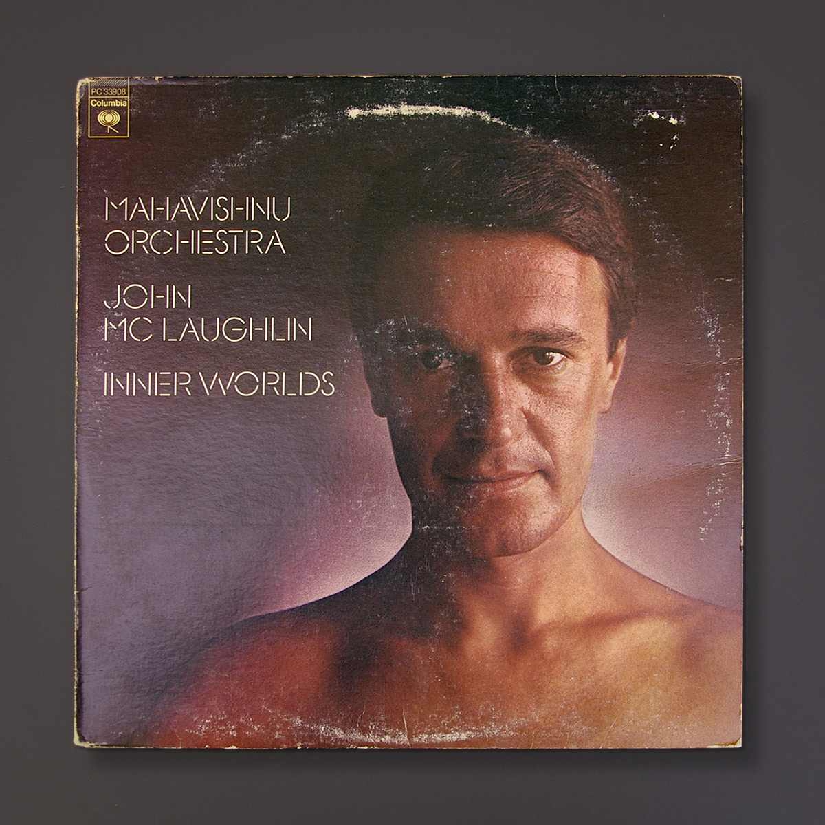
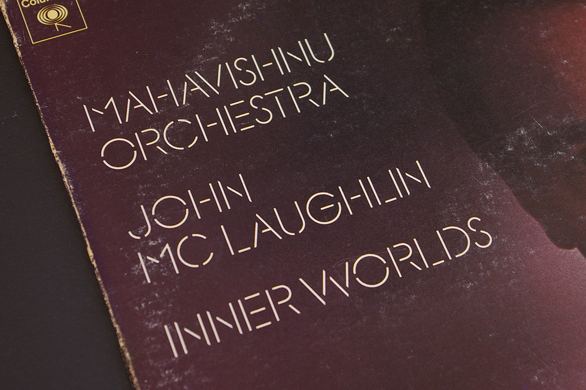
1972.
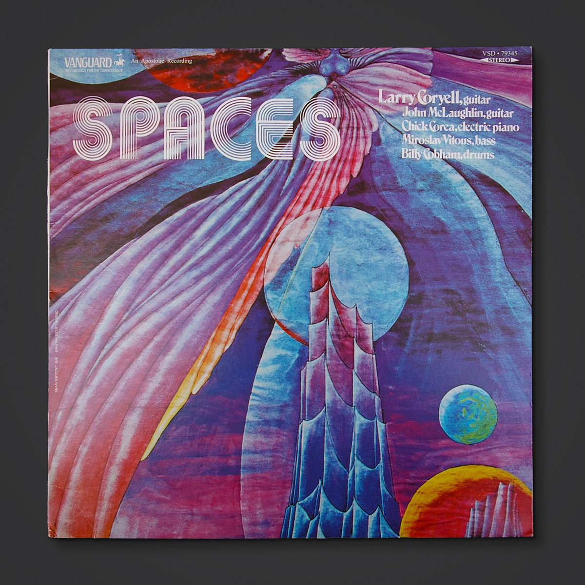
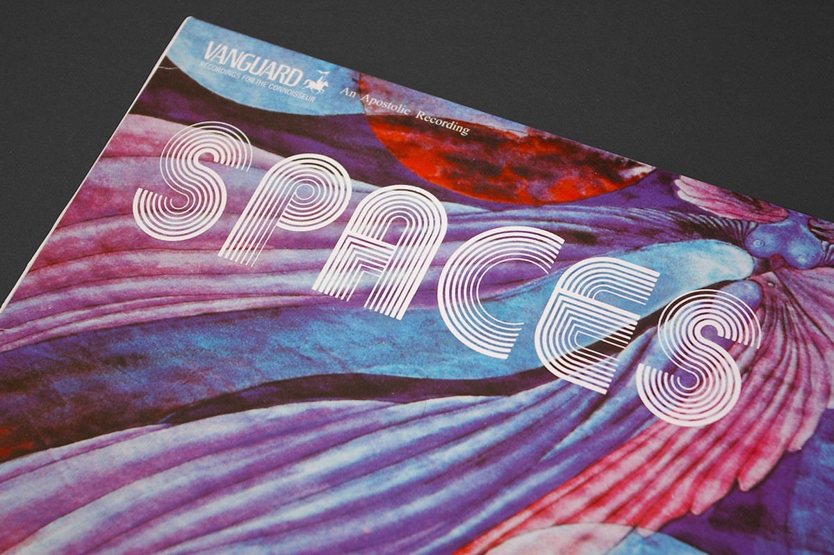
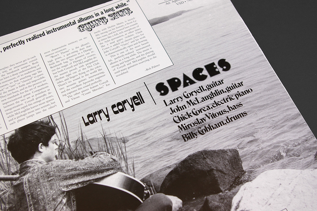
1978.
1979.
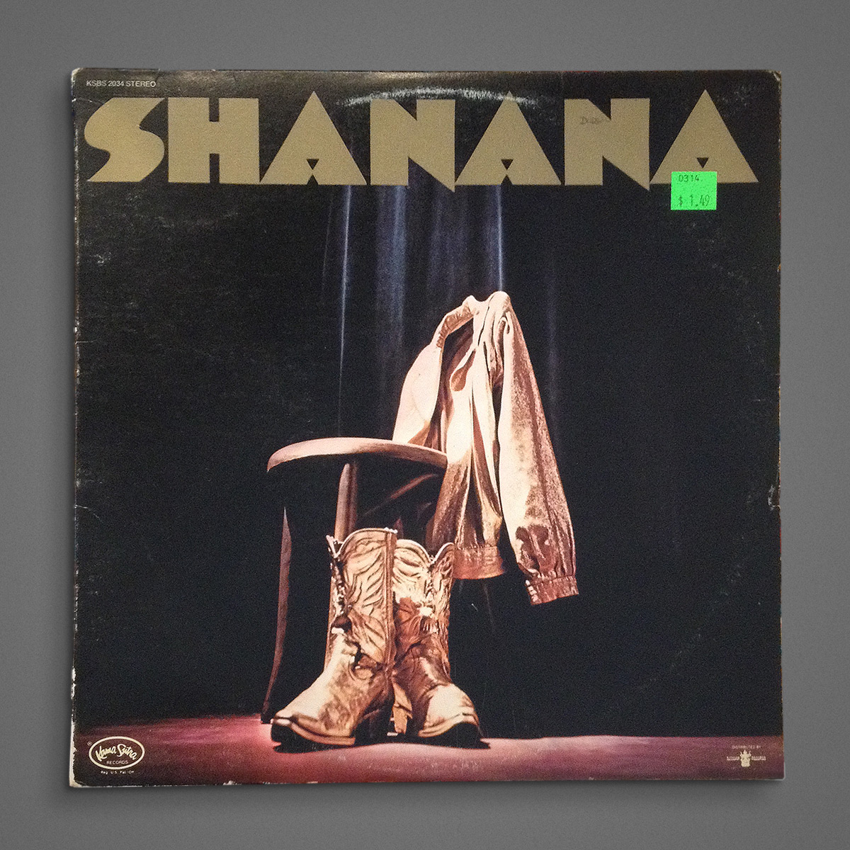
c. 1973. Shot by Shawn in store.
Here’s another one for the record company logo blog I’ll never do. 3 for the price of one. This is from 1978.
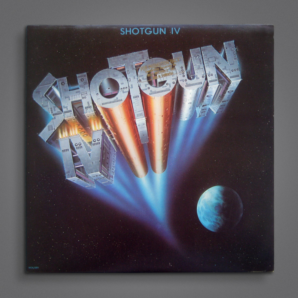
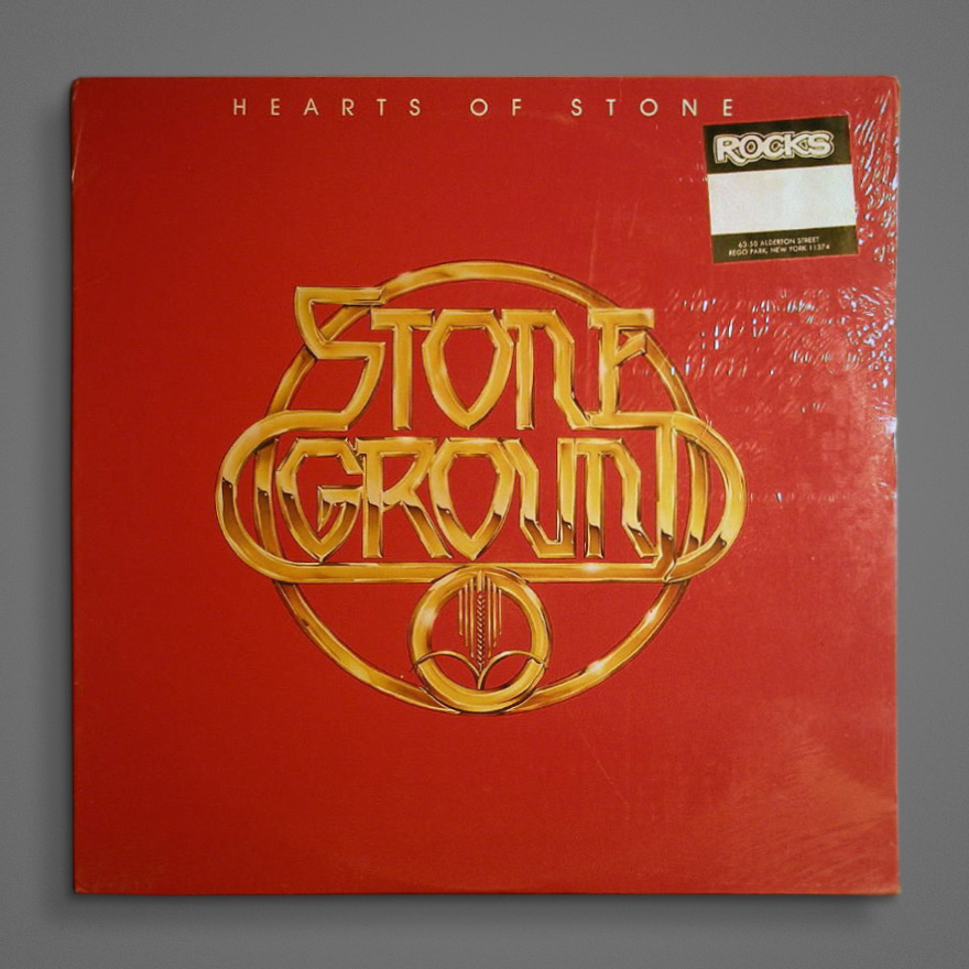
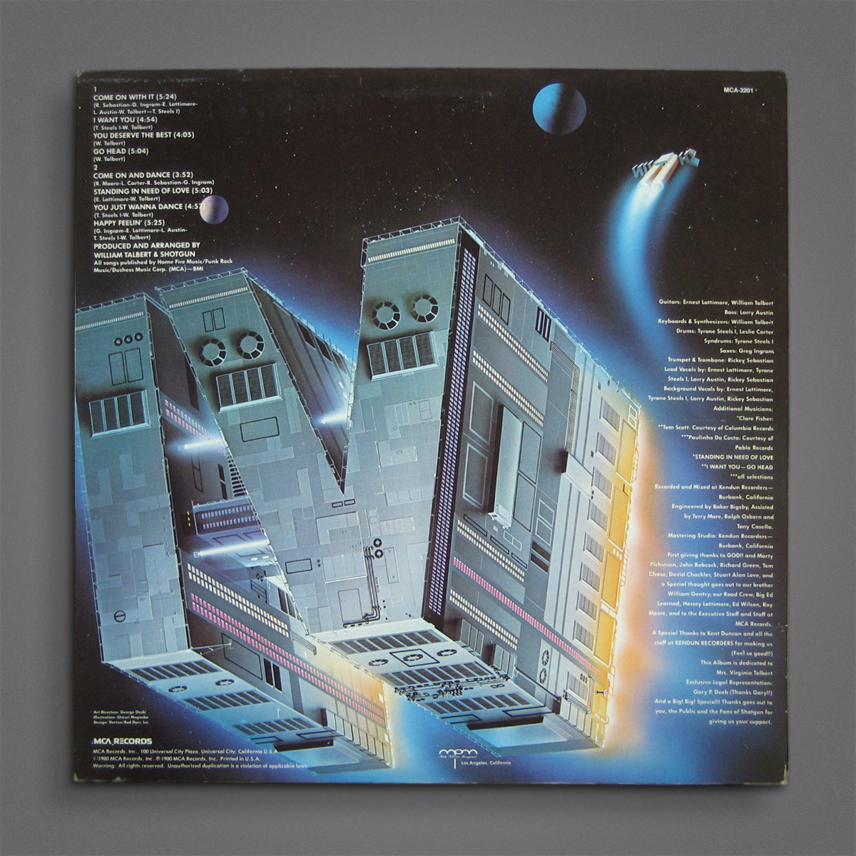
Man, these guys weren’t messing around. This is from 1980. The back is even better:
The one that followed (also 1980) tried to push it even further, looking like something outta Game of Thrones:
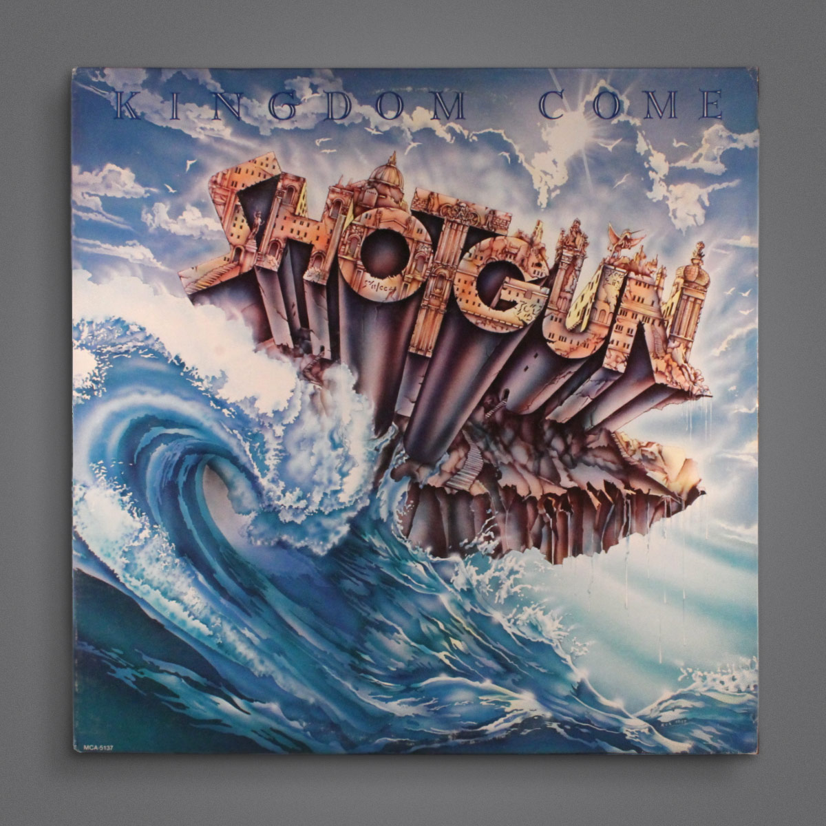
This earlier one, from 1979, is no slouch, either: