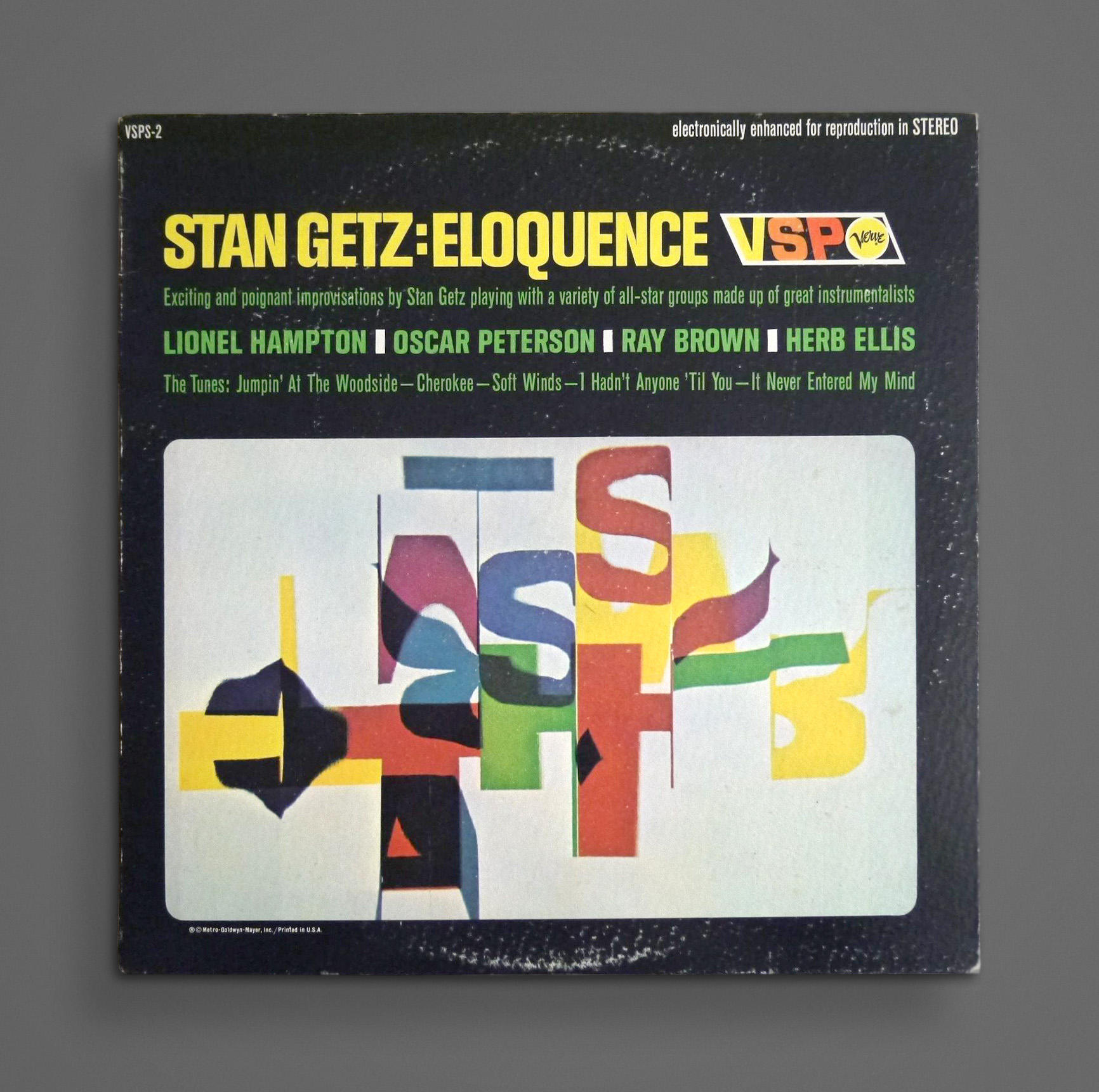
Very cool typographic experiment from 1966.
Link →
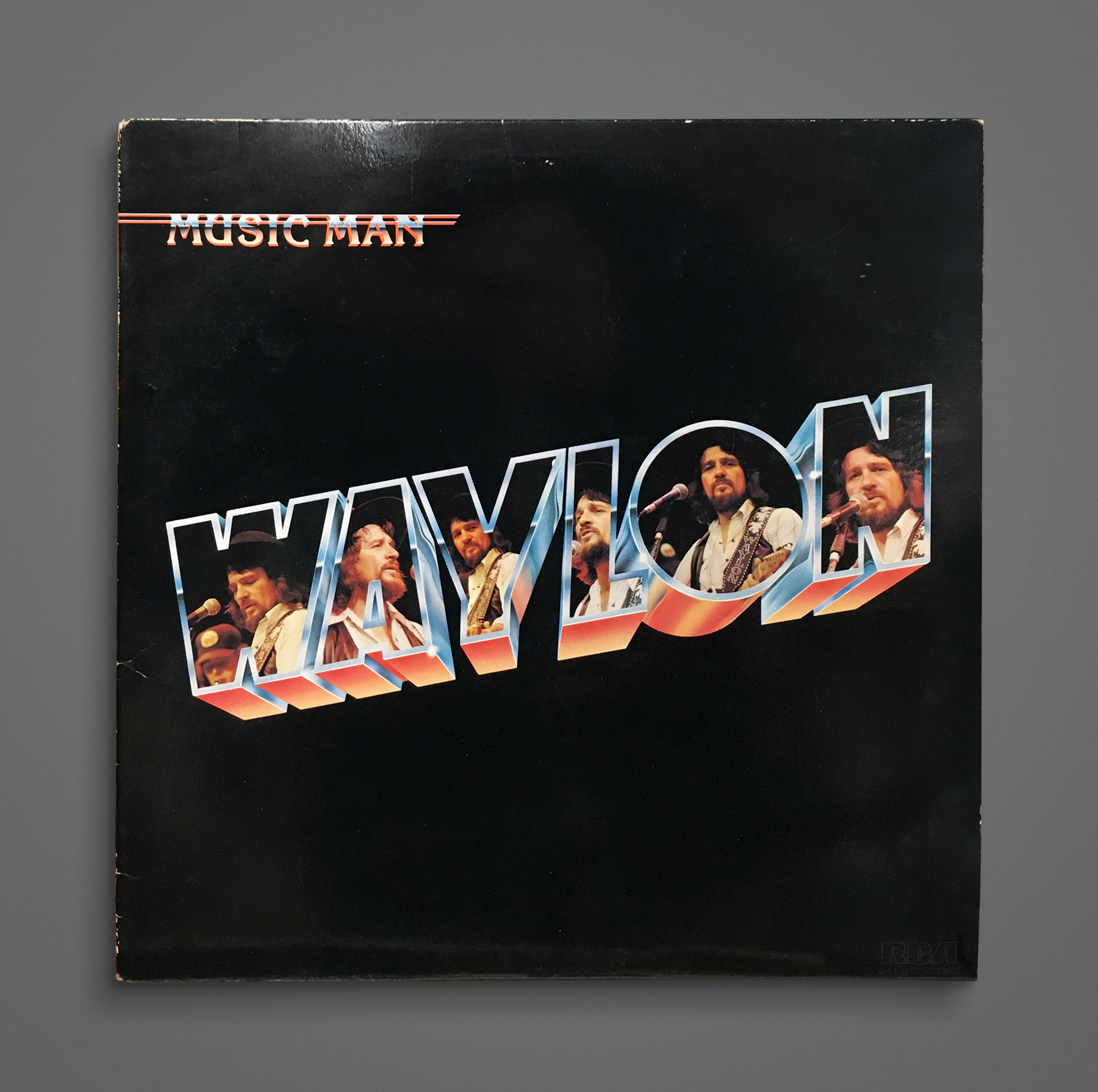
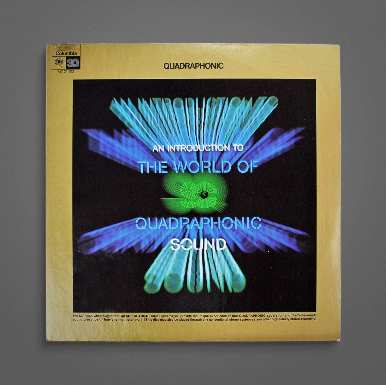
1980.
Link →
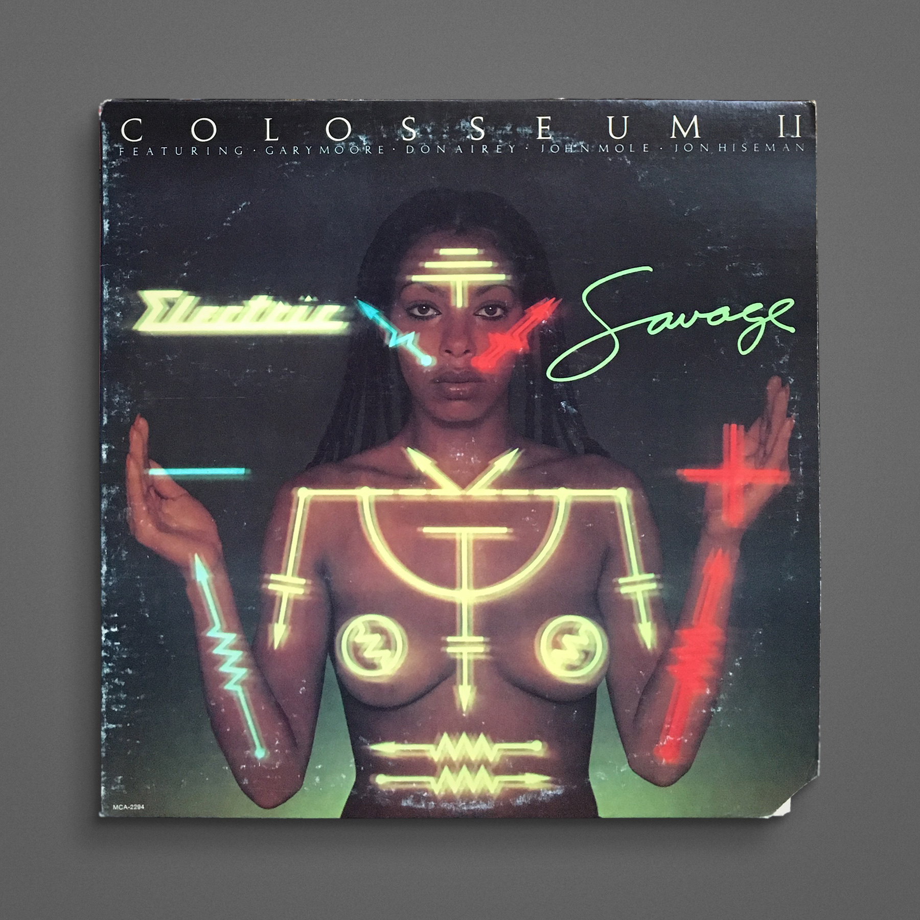
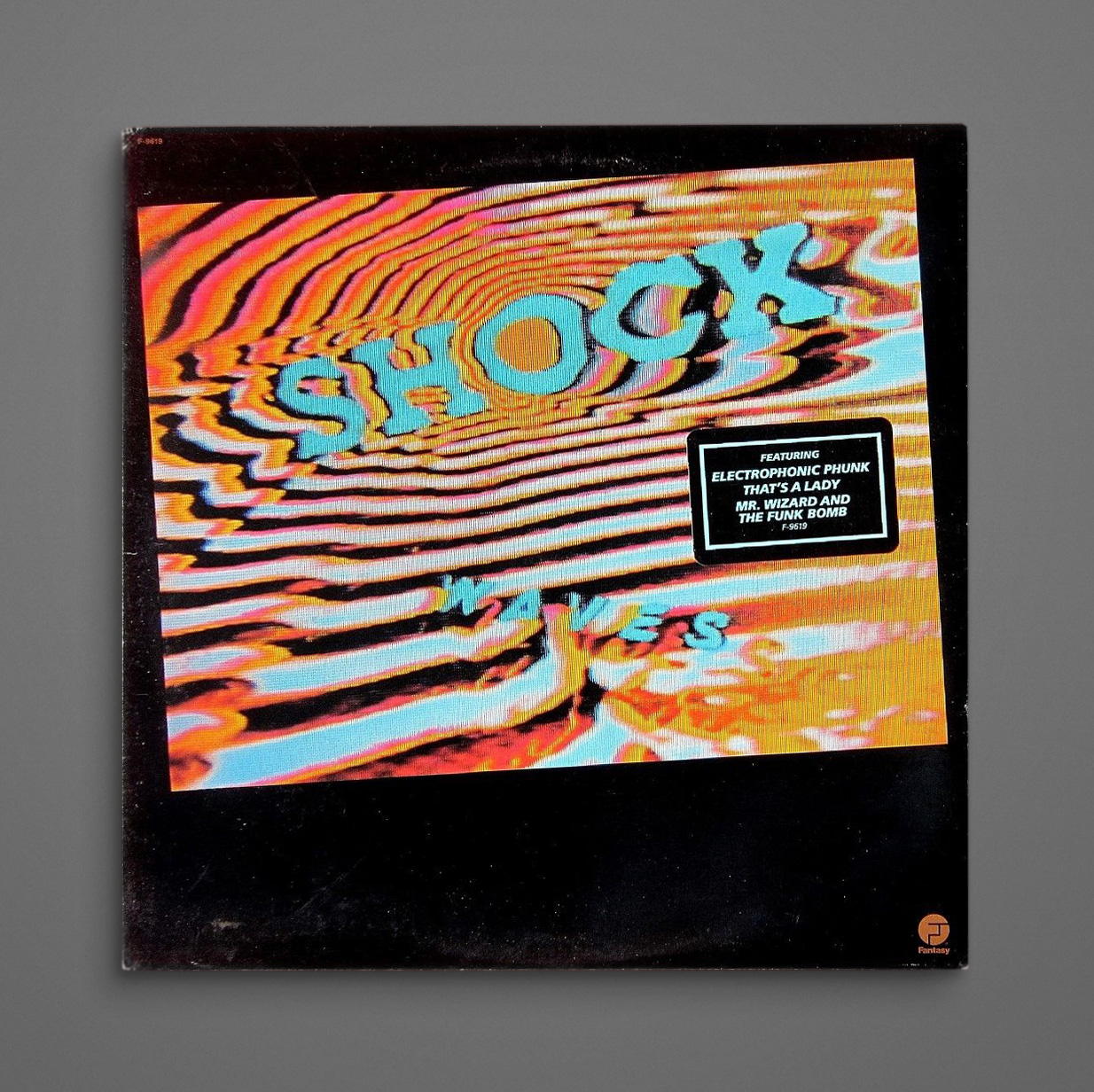
1977.
Link →
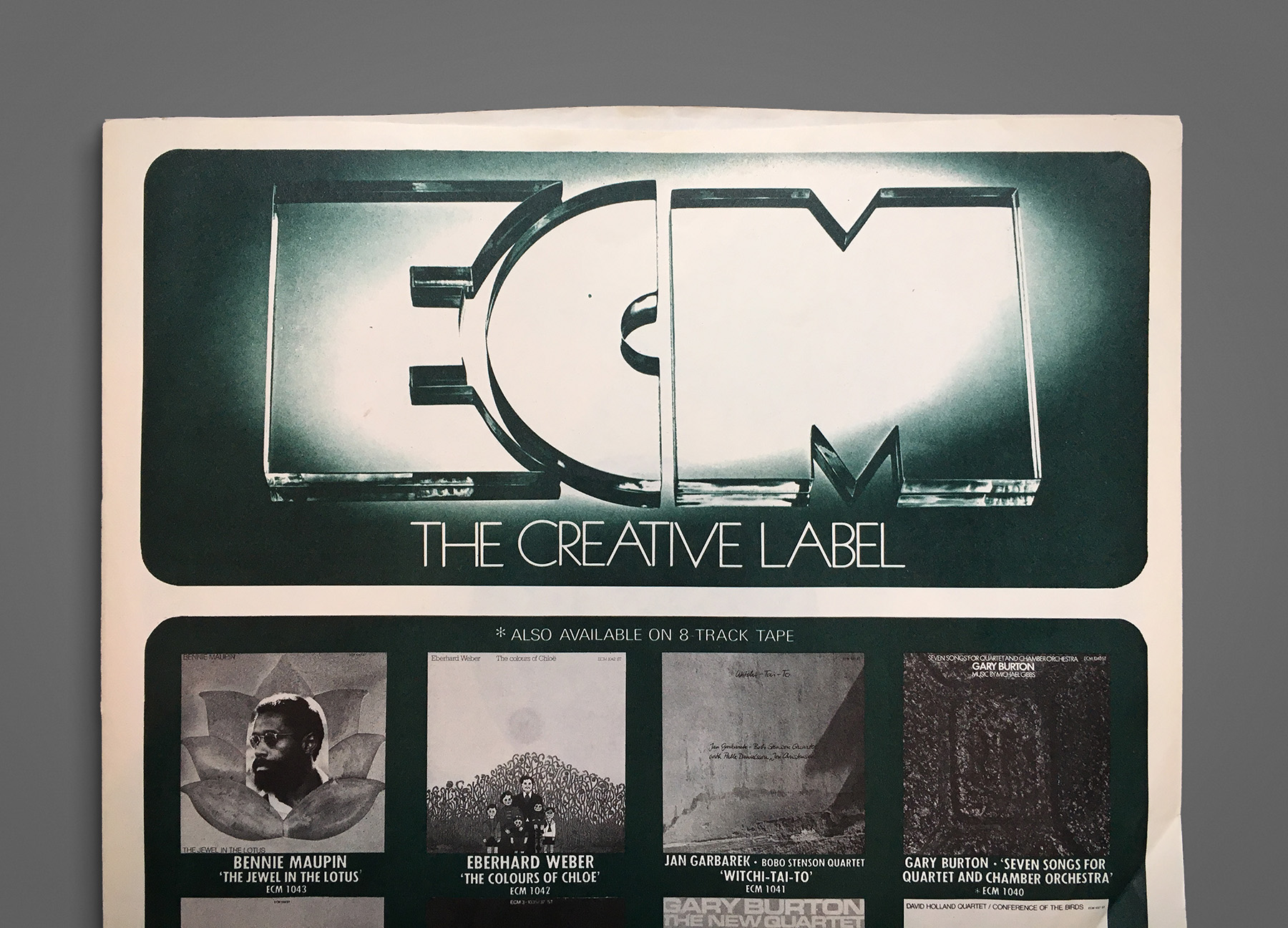
Inner sleeve from 1975. Always liked ECM’s logo. Like it even more make out of glass!
Link →
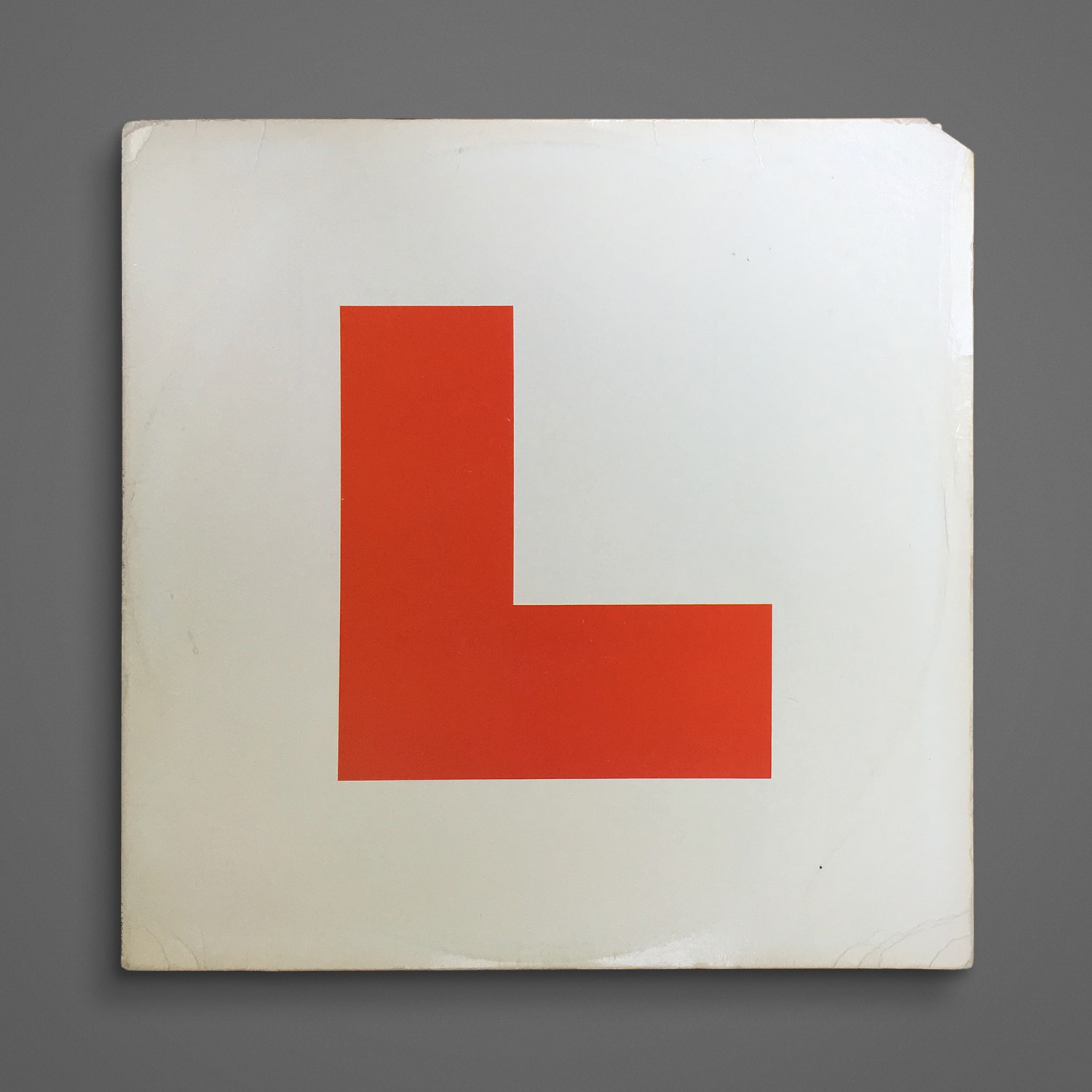
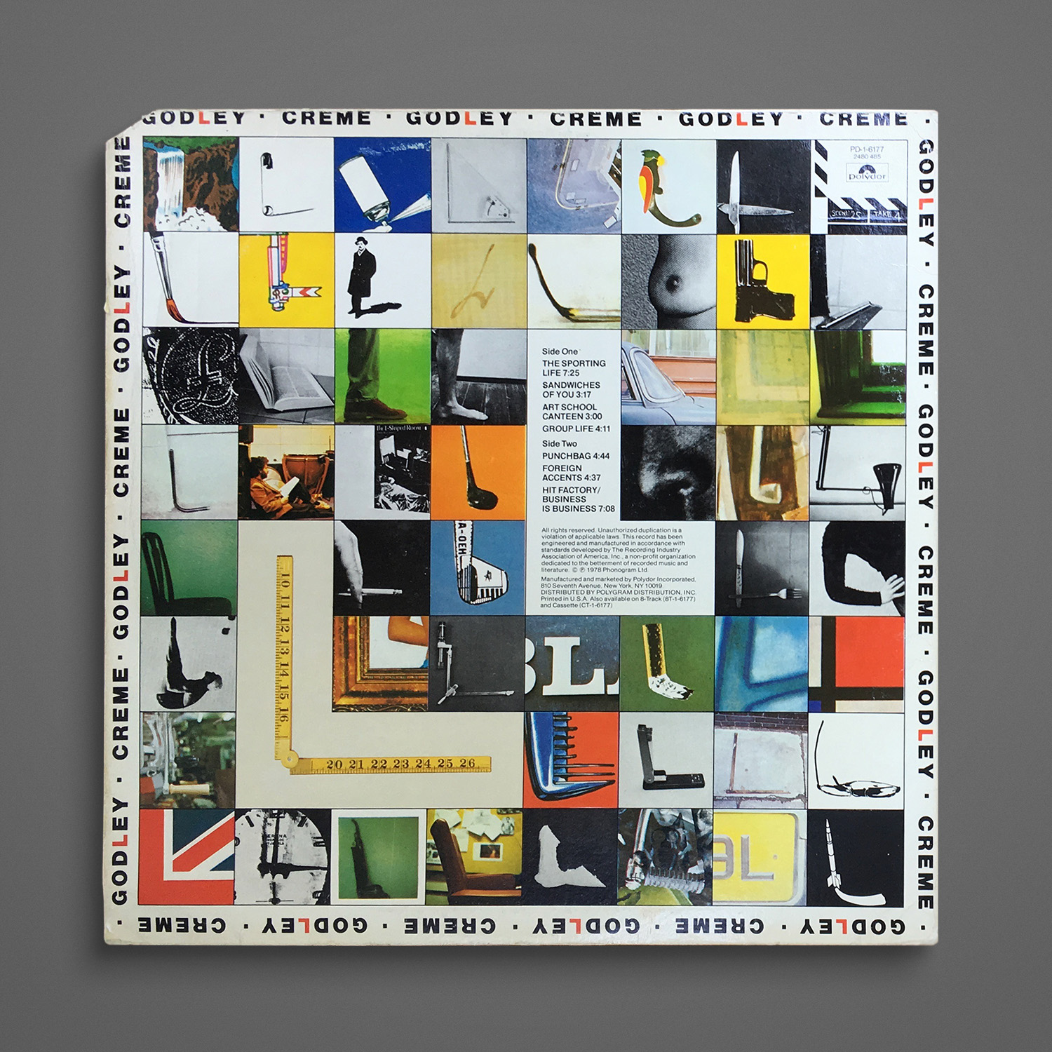
1978. Doesn’t get much more minimal than this (That’s an “L” BTW.) Then there’s the back to make up for it…
Link →